Tuesday, 25 August 2015

Week 3 - Retail display

Woolworths


How does the display of products in a supermarket vary?
I went to Woolworths as this is where I do majority of my shopping. In Woolworths there are many different displays of their products. On the end of their aisles they have just one product which is being promoted. When I looked it was the brand "Shapes". They make there display bright and colourful so it attracts the buyers attention and they always have it fully stocked, where as down the middle of the aisles they have their products displayed in a normal way, all side by side, with no other promotions other than the products themselves. They also have displays in cardboard boxes. They don't tend to stand very tall but are usually situated near the counters. These are put into place so when you put your items onto the counter to pay, these displays catch your attention and some people grab them as a bargain, or at the time its a good idea to buy. They tend to put new items in these cardboard displays to get their brand out. They catch the buyers off guard, which is great for promotional purposes. The fruits and vegetables are all displayed in singles. They are not packaged or wrapped, they are displayed openly. This is so you can choose the ones you want to buy. The seafood and meats section again is displayed differently, they are in a chiller, but behind glass so you can still choose want you want to buy.


What does the display say about the products (ie. how are the vegetables displayed and how does this convey an idea about "freshness")? 
The end of the aisle displays are put into place to promote that product. Woolworths rotates the products every so often so each product gets a turn. This doesn't say too much about the product themselves it just helps with promoting their products.
As for the fruit and vegetable sections, they are displayed differently. They are all laid out in sections one by one and this promotes freshness. When customers get to pick and choose what fruit and vegetables they can buy, they seem to be happier about that than what they would be buying a bag of apples and so on. They can choose the best quality ones and leave the not so great ones behind. They get their moneys worth which is what customers want. 
The cardboard displays are to promote a "new" product. They are designed to grab the customers attention, so they can have a look at the new product that has just been released. This displays simply tells the customers that their product is new and is trying to get their brand and identity out their. 
Down the aisles the displays are just side by side. This kind of display is telling us that the product is not new its a product that has been around for a while and is just trying to be sold to consumers. 

What visual clues are given in a supermarket display to make you feel something about a product (ie. excitement because the product is "new" or to give you an idea about the "quality" or "freshness" of a product)?

Sometimes when you see displays in Woolworths, they have the word "new" in large letters to let the customers know there is a new product available. This "new" phrase is used to make people feel excited and happy about a new product that has reach the stores. Consumers first reaction is to go and look at the product, and most of the time people will buy the product just to test it out and give it a go. These types of displays make the customers enthusiastic about shopping and finding new products. 

When walking down an aisle in Woolworths and you have just the aisle displays down each side, than when you come across a shelf where a product should be and have heaps of, and there isn't many there, that to me makes me feel that the product is popular and ultimately good. This encourages me to buy this product just to give it a go. It makes me feel happy that I may find a decent product worth using or having. 

Monday, 17 August 2015

Week 2 - How does packaging indicate brand value?

T2 tea vs Lipton tea


T2 is a tea that thousands of people start and end the day with. T2 have stores all over the world including; 65 stores in Australia, New Zealand, United Kingdom and America. It is Australias leading tea retailer, offering the countries largest range of premium, fragrant tea and tea wares from all around the globe. A select range of T2 teas are also served in some restaurants and cafes throughout Australia, while packaged T2 can also be found on the shelves of leading food purveyors. The iconic brand is beautifully packaged up in an experience that is both unique and immersive; a celebration of the centuries-old art of tea making. 
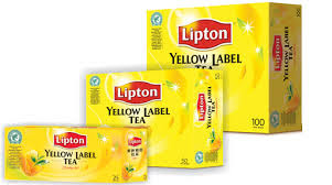
Lipton tea is the tea that is positioned in the middle of the price spectrum. Lipton teas are a blend selected from many different plantations around the world. The Lipton Yellow Label is blended from as many as as 20 different teas. Apart from the Lipton Ice Tea, none of their products are available fro retail in the United Kingdom, as only caterers are supplied. 

What colours, typefaces, graphics does the company use on the packaging? What does this say about the value of the product?

T2 uses brightly coloured packaging, ranging from blue to orange. Orange is the main colour they use for their packaging because its extremely bright and fun. The typeface used on their packaging is a sans serif, bold. They use the heavy weight just for the "T2" writing than as you move down the writing gets lighter in weight and smaller in size but the typeface stays the same. The packaging does not have images or pictures it sticks to just text, this is because their packaging is so bright that there is no need to have graphics, as it will overload the design. As well as the orange boxes as their main packaging, they also have orange paper carry bags. These are used because its easier to carry than a box. They only have "T2" written on them in white. They also have gift wrapping. The gift paper changes all the time as it represents the look they are going for at that time. The last packaging they have is a black bag with the coloured label on it. This bag is like a zip lock back that you can refill your tins with. The colour of the labels determine what flavour the tea is. The packaging that T2 uses shows us that they are encouraged by their target users. Using bright colours attracts the eye of so many people. When a brand takes the time to get their packaging and designs perfect you can tell that thats only half the energy that they put into the products themselves. The beautifully designed packaging tells us that the T2 produces care about the way people view there products, and when products look good, the people straight away believe the value of the products are of high standards. 


Lipton tea uses bright yellow for their packaging, with touches of red and green to add some effects. The logo typeface used on their packaging is a serif, bold, than on the rest of the packaging they use a san serif typeface thats smaller in weight. This packaging is quite different to T2, as Lipton has graphics on their packaging. To start with they have their logo, than they have a picture of a clear tea cup with green leaves situated next to it. This graphic i think it great for packaging as straight away we can tell it is a tea brand. The packaging that Lipton tea uses shows us that they have gone with a simple look, but also gone with a look that many other tea brands go for. The graphics used are very popular with other brands so it puts them in a category with them, and not one by itself which is what you want. Using the bright yellow attracts the eyes of people too which is a great marketing strategy. Because the Lipton tea brand only has one type of packaging it shows that the company has not put too much effort into there designs so it could mean that they don't value their product as much as other companies do to their own. The beautiful yellow does make a statement but since they haven't thought too much of their packaging people might steer clear from that brand and be pushed towards a different company that has thought of everything. 


What materials are used in the packaging (ie. card stock, foils, specialty papers, print treatments)? What do the materials tell you about the product value?

T2 simply uses cardboard boxes as their main type of packaging. They have sticky labels that are than stuck onto the boxes to tell you what the product is. The labels have a glossy finish and are very smooth. The boxes themselves are also smooth. With the orange paper bags, they are the same materials used with brown paper bags, just much more sturdy. The tea refills have a matte finish to the outside and have a foil inside, to keep the loose leaf tea fresh. Inside the cardboard boxes the loose leaf tea is wrapped in a clear plastic air tight bag, this is to keep the tea fresh and does not make a mess. The materials used for the packaging of their products are quite reasonable. They use these materials for a reason, and they show their audience that the care for their products by simply looking after the tea itself in safe bags and boxes. The materials show the target audience that the value of their products are of high standards because they are all bagged up and packaged perfectly so nothing can go wrong. 

Lipton tea uses a cardboard box as their packaging. The cardboard box has the Lipton logo on it which has been printed into the cardboard, along with all the other writing and the graphics. The cardboard box has the colours on the outside but inside is just your typical brown cardboard box look. Inside the cardboard box their are tea bags and they are all sitting side by side with no extra wrapping. The only thing that is keeping them fresh is the cardboard box itself. The cardboard box shows that the packaging is sturdy but when opening the box, the value of the product drops massively as their is no other protection for the tea bags. This decreases the value of any product if the packaging is not correct. 

This is my mood board for my brand and product.


The brand I want to create is a home decor brand. I like to have a broad range of items to be able to work with. The product I would like to create is a range of candles.
Candles are something I use and enjoy using, they relax the body and can make the home look beautiful. Another reason for choosing candles is that every household has them/needs them and they are always very popular at the markets. Families use them for either design or practical use. So since ill be having such a broad market, I feel confident my candles will sell.
I will design multiple candles, all shapes and sizes. They will have different techniques used on them, for example, some would be painted on and some would be engraved. Using different techniques shows the audience I have put lots of time and effort into them and will make them feel confident in buying my products. 
I will call my company something similar to "Elegance" as i want my home decor items, and candles to be beautiful and elegant. This is the type of logo I would use for my brand identity for my candle brand. The typeface which is a cursive typeface works well with the home decor theme. Cursive typefaces are flowing and soft just like a home should be. 


Tuesday, 11 August 2015

Week 1 - Retail Brand Research - Smiggle


What is the company's "brand story" and how does this communicate in the design of the products and packaging?


Smiggle is an Australian based retail store that sells stationery and related accessories. It is the world’s hottest stationery brand, which was born in 2003. Smiggle was founded in Melbourne by Stephen Meurs and Peter Pausewang, and is the ultimate creators of colourful, fun, fashion forward stationery. Stephen and Peter saw a large gap in the market for fun, engaging, collectable, fashionable and affordable stationery in the early says and this is what pushed them to create the brand Smiggle. Smiggle is a mashup of smile and giggle, and this reflects their aims for the products.

The very first Smiggle store opened in Melbourne. The word spread so fast about the brightly coloured pens and notebooks that the company took off and soon had 20 stores all together. Smiggle caught the eye of the Just Group – Australia’s most exciting fashion and apparel retailer and was acquired in 2007, where it never looked back. In 2008 Smiggle jumped the seas and opened its first international store in New Zealand, soon after in 2011 it than expanded into Singapore and in 2014 opened in the United Kingdom. This is all part of the grand plan, to be the world’s most exciting stationery brand.

Smiggle wanted to be the worlds most famous stationery brand that was full of colour and fun, and by taking in the needs and wants of their target market they have become very successful in doing so. The creators have communicated this in their designs but mainly just one element, brightness. 


Who is the target market of the company? How do you think they address this target market?


The original target market for Smiggle was 14 to 25 years. That has now expanded over the years and has broadened to ages 10 to 40 years. They made sure they didn't lose their original customers, which were young teenage girls, but they've given the customers the opportunity to purchase a product thats good quality, well priced and gives them an identity. As we know peoples eyes are attracted to bright colours, and Smiggle has created their products to do exactly that. They use every bright colour you could think of and have all the stationery a child could need for school and at home. Smiggle has captured the imagination of the children across the country, is endorsed by parents and is the driver of trends in and out of the classroom. Their products have images of cartoon animals on them, which is another attribute that children love. Their products and packaging define children and their wants and needs.


What type of packaging does the company use? What does the packaging say/make you feel about the brand?


The packaging that the company uses is full of vibrant colours and quirky graphics. Smiggle tend to use sophisticated paper bags once you purchase something. The carefully wrap your products in paper than they place them into the sturdy paper bags. This shows they value their customers. The brand Smiggle makes me feel happy. The beautiful colours used and the stores themselves would make anyone’s day brighter. Their packaging is fun and bright which says to me that the company is here for children and to brighten up learning and the way children use and see stationery. The company clearly focuses on their target group, which is how companies need to be if they want to be successful. Smiggle is a great example of a brand that has reset its category. Driven by a strong vision, clearly defined by brand proposition, distinct identity and deep connection with its audience, it is definitely a standout brand.